Tuesday, October 16, 2012

Home Stretch


Have been working steadily getting everything done. It is a little like juggling jelly uphill in quicksand though, every time I think I have everything sorted, something else slips and I find myself focussing on a different aspect of the project or exegesis. 

But at this point in time I think that I have finished the project. Correction, I know I have finished it. Everything is being put on discs and is ready for submission. Now I just have to work on the final phases of the exegesis to ensure that everything works well as a study and demonstration of researched knowledge. 

So that's where I am at the moment. Supposed to be re-reading and editing my exegesis. Instead I printed a DVD cover. 

I've also had it suggested by my supervisor that I present the backgrounds in a gallery format printed large so that the pans can be appreciated in terms of scale and detail- so that's happening now. And on Halloween I'll be presenting them at uni and talking to the assessors- nervous much? Yes. Once all has been completed I'll blog again and let you know what I thought of the entire experience- a year of my life coming down to essentially a single grade- madness; but hopefully worth it. 

Progress Shot

Progress Shot

This is starting to look finished....

Back of the DVD case

Wednesday, October 10, 2012

Project: Final To Do List

Final To Do List


Revise Backgrounds
Check bugs                           Scene: 1   2   3   4   5   6   7   8   9   10   11   12
Extend pans                           Scene: 1   2   3   4   5   6   7   8   9   10   11   12
Add fade to black                  Scene: 1   2   3   4   5   6   7   8   9   10   11   12
Add 'title cards'                      Scene: 1   2   3   4   5   6   7   8   9   10   11   12
Add details                            Scene: 1   2   3   4   5   6   7   8   9   10   11   12
Replace large files                  Scene: 1   2   3   4   5   6   7   8   9   10   11   12
Animation in each shot           Scene: 1   2   3   4   5   6   7   8   9   10   11   12
Extend Width in long pans      Scene: 1   2   3   4   5   6   7   8   9   10   11   12
Analysis scenes                      Scene: 1   2   3   4   5   6   7   8   9   10   11   12

Finalising
Save jpegs                             Scene: 1   2   3   4   5   6   7   8   9   10   11   12
Save as movs                         Scene: 1   2   3   4   5   6   7   8   9   10   11   12
Burn as DVD/CDRom  
Add DVD Menu
Print Disc
Print Cover
Email backgrounds for printing

Exegesis
Revise Chapter 1
Revise Chapter 2
Ensure connection between project & exegesis is clear
Remove 4th wall section
Add analysis of Bioshock backgrounds (if needed)
Include explanation of the project and format
Write up Chapter 3- forward looking (future study?)
Revise in text referencing
Revise fig list
Revise Reference list
Revise bibliography
Page numbers
'Cold' Edit
Final Edit
Submit colour plates for printing
Change cover
Print 
Submit for binding

Wednesday, September 19, 2012

Background Complete


The is the latest background I've been working on for the past couple of days. I knew this one was going to be detailed because of its role in the project. This is it without any lighting or effects of any kind- I'll do that in post.

Every object in the room is there for a reason and it helps progress the narrative or reveal character in my project in some way. And yep every object is self contained and ready to be put into Toon Boom. So far on track.

Tuesday, September 4, 2012

Blogging Hits a Snag

I like to blog, I can freely admit that. So it was with horror that I discovered that I was over my limit for the number of pictures I can have on my blogger account :O Now because I'm kind of in the middle of something- ie: my honours project and an exegesis- I can't be bothered working out how to fix this problem. Therefore I'll just have to provide links to my photos which for the time being I will store on my Tumblr.

I'm now working on the large pans that I had been putting off till the end so you will find the next two here. With these pans I'm really focused on a contrast to the previous shots, these long pans give me the opportunity to show a flattening of the landscape. This is a deliberate aesthetic choice as it exaggerates the conformist same same nature of suburbia.


Monday, September 3, 2012

Another Background

Another Background done in outline draft form with accompanying depth identification showing the layers within the landscape.

Slow and steady, but determined to get it done.

Walking down the street- Modern Day

Walking down the street- Back in the old days


Thursday, August 30, 2012

Meanwhile, Back at My Project.....

Having spent a week fussing with the exegesis, it was time to get back to the project- You remember the project? The thing that all this writing and researching is meant to be all about? Yeaaaah. So I got back into it and Act One is all done for line work.

Below are the basic line guides for some backgrounds. These are guides, the final won't have big stinking outlines all over them.

Act1Sc2

The Kitchen

Pan of Street- Modern Day

Pan of Street- vision of the past

Voyeur style view of a street

Same street but in the past

I'm also including a colour coding process of depth that will also assist with layer creation in photoshop. Works on the principle that the further away something is in the distance, the lighter the colour:


Tuesday, August 28, 2012

Tough Day at the Office

The post title sort of captures my afternoon at uni. After spending the night before tinkering on my exegesis and working on getting it into some form of 'okay-ness' I got the opportunity to sit down with the lecturer and go through it page by page.


Shit. After about an hour I was beginning to doubt my ability to string together a sentence, let alone research and construct an argument. Don't get me wrong it was completely beneficial and important that I get all the kinks out now, but still it was a full on session.

I agree with most of the criticisms and it's funny how you just can't see the problems but you know something isn't right, and it isn't until someone points is out that it clicks.

So even though this afternoon was rough, it was cathartic in a way and I'm just glad that I did it sooner rather than later. Rewrites are in order and then I will put the exegesis to one side and focus on the project to get that sorted. During this Honours year it has felt at times as though I am juggling jelly underwater, but I think I will get there in the end.


Monday, August 27, 2012

Break Through

Have been working this week largely on the essays for SIGGRAPH and the exegesis. My plan is to try and get that side of it pretty much under control because I know the project itself will dominate my time over the next two months. TWO MONTHS? Is that it?! Yep everything due on the 24 October. Now is the perfect time to panic.

Good news though I did discover Google SketchUp today, free online program that allows you to model (very crude) 3D models. This is going to be perfect for me in the line drafting phase of the project. Much like the miniature hand made models of Claude Coats, this program will allow me to view all angles of a scene without having to constantly redraw it from a different perspective. And on the subject of perspective, it will help me out a great deal, especially as I am gearing perspective for the sake of the viewer and not character.

Here are some basic ones I did today, just to give me an idea and the best thing is that I can use the same models for a number of different scenes.


Monday, August 20, 2012

Semester 2 Panic Schedule


TIMELINE: PROJECT & EXEGESIS SIGGRAPH


WEEK 1: 20th Aug
Draft Backgrounds
Complete Intro 
Complete Conclusion
Update previous draft- in terms of updated project- to hand in
Blog Completed Online

WEEK 2: 27th Aug
Draft Backgrounds
Exegesis reference list
Exegesis Bibliography


WEEK 3: 4th Sept
Render Backgrounds
Chapter 1 Completed
Essay Completed

WEEK 4: 11th Sept
Render Backgrounds
Chapter 2 Completed

WEEK 5: 18th Sept
Render Backgrounds
Chapter 3 Completed
Image list- Figs / Image list- Plates (own work)

WEEK 6: 25th Sept
Render Backgrounds
Chapter Titles
Review Formatting / Final Draft Completed

WEEK 7: 1st Oct
Review Progress- Finish Drafting / Rendering
Abstract

WEEK 8: 8th Oct
Composite / Camera- if applicable
Final Images of studio project

WEEK 9: 15th Oct
Composite / Camera- if applicable
Export
Final Review and Edits / Print & Bind

WEEK 10: 22nd Oct
DUE WEDNESDAY
DUE WEDNESDAY

Tuesday, August 14, 2012

Reflections on SIGGRAPH

Having now completed a week as a Student Volunteer at SIGGRAPH 2012 and had a good sleep to recover I feel that I can now reflect on the experience and its value to my studies.


Firstly, the decision to fly across the world to attend a conference during the teaching period of your one year Honours degree, was a decision that I really had to think about. If I went, would I have enough time to finish everything when I got back? Would I ever get an opportunity like this again? Would it be worth it? Well...goddammit I hope so, probably not and yes. The tipping factor for me was the opportunity not only to attend the conference, but attending as a student volunteer would force me to network. Secret about me, I'm pretty shy, I bluff well, but I'm shy. So having a purpose and an equal footing with other student volunteers really helped me connect with like minded artists and animators. Plus having an Aussie accent was a novelty in LA so I already had an ice-breaker.

I arrived a couple of days before the conference began and although I had jetlag I would recommend to anyone who is going to do student volunteering, if you can do shifts prior to the conference starting- do it. This takes some of your 30 hours of shifts and will give you a greater chance of seeing more of the conference once it cranks up in the final 3 days. One of the first things I noticed about my shifts was that 30 hours (31.5) didn't leave a lot of spare time and I was really going to have to be organised to see what I wanted at SIGGRAPH. Through shift swapping I was able to see the Brave Panel which was fantastic and there were some panels and presentations that I chanced upon due to an early shift, but overall there were a lot of things that I missed due to working. And that's to be expected and I'm certainly not complaining, but it is something that you have to be prepared for as a student volunteer. Working 30hrs was part of my deal in return for free accommodation and full conference entry.


Accommodation was well swanky, we stayed in the Sheraton Downtown LA. I say 'we' because it was share accommodation. I shared with two other animators who were fantastic company and I now count them as friends. It was great to find two talented people who had great senses of humour and loved to be sarcastic and take the piss out of all things. So yeah, we fitted well and it was fun. Nat has an online folio and you can see that here, still waiting for Sarah's. Both the girls had been doing internships with studios and that was something that I found was much more a priority in the States with animation education.

The conference itself was awesomely inspiring and it sounds dicky but it was great to actually see that the people who work in the animation industry are just people. Highly talented and generous people, but still people. One of the things that I think is great about this industry is that most people are willing to give students and noobs a chance, some advice or a reassuring word about how to get into the industry itself. The opportunity to meet people is the thing that makes the 30 hours of shifts all worthwhile. From industry leaders to students about to break into studio positions to technology artists and retailers with new software and hardware; the chance to be immersed in this experience is something that I am glad I took a chance on during one of the busiest years of my life.

All of this networking also forced me as an artist and animator to verbalize my preferred role in the industry. It wasn't enough to say that you liked animation or liked to draw, given that the American education system focuses on specialisation you really had to seek out and decide what area/s most appealed to you and then forge connections in that area. For me as a 2D animator I was an oddity at a computer graphics conference, but I found that it sure-d me conviction in my desire to work in the art development- preproduction phase of animated films either in background concept, environment creation or storyboarding. Listening to the Pixar panel on Brave and hearing the process of taking an idea and making it come to life on screen I was inspired by the work of the visual development department and how instrumental they are in directing the overall look of the film. I have never wanted to be an independent film maker, that's just not my thing, but I do want to be a small part of something bigger and visual development is that area for me.


That's why when I went into the folio reviews, I was really focused on getting feedback on whether I have any hope of getting into the field of visual development or backgrounds. The two folio reviews that I did do were excellent in providing me with the opportunity to have my work seen by someone completely removed from university and from a purely professional standpoint. It was also good after the reviews to talk to fellow Student Volunteers who had also undergone reviews to get their perspective. The job fair in the exhibition also provided invaluable opportunity to talk with employers and find out their ideas on what they would want from new animators and artists. Swapping business cards and making connections with people was perhaps the most valuable aspect of the conference. 

In addition to the networking, attending the panels and seeking out resources was really inspiring and even though the jobs that you do on shift range from pedestrian (counting people in a room) to interesting (working in the gallery) they do give you an opportunity to meet new people and learn new things. During the conference I was able to attend the Pixar Brave Panel and Disney's Paperman but I also by default of working a shift in the lecture theatre I was able to listen in to new research in the areas of photography, animation and CGI films such as Brave, Wreck it Ralph and Sesame Street computer games. The Student Volunteer program also organises a series of presentations that are perfect for students and focused on making the transition from university to workforce. Unfortunately for me, many of these were on whilst I was on shift- which is why I recommend doing shifts prior to the conference start. There were also other programs available such as the Autodesk student night which was great and had presentations by Animation Mentor, Disney and Autodesk; And the 'birds of a feather program,' about visual development (although this one was oversubscribed for the pitiful size of the room at the Marriott). 

Counting people


All in all now that I've done it, would I do it again? Yes it was definitely worth meeting people and learning new things and just being exposed to the industry was an awesome experience. Would I do things differently? Yes, I would do as many shifts prior to the start of the convention. Would I recommend others to volunteer? Absolutely. 


Sunday, August 12, 2012

D23: Day 2 Andreas Deja

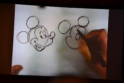
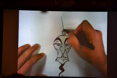
Here are some of the progress sketches by Andreas Deja done at the D23 Conference.


Deja began by sketching Mickey Mouse in the traditional three quarter view, then demonstrated how animators cheat reality by showing us what Mickey would look like if he were drawn front on exactly as he appears in the three quarter view- a mess. 


Special needs Mickey
To combat the awkward looking Mickey, the front on version changes the position of the ears, the nose completely turns sideways, the snout moves and the mouth also moves to the centre.


Next, Deja drew some of his most famous characters, Scar: 


And Jafar from Aladdin. I stand by the claim that villains are infinitely more interesting than heroes in most Disney animation films. 


Andreas Deja is one of my all time favourite modern day Disney animators, and it was seeing Scar come to life in the Lion King that first made me realise that I didn't want to be a teacher forever and that it was time to look for ways that I could get into the art of animation.