I remember when I was young, my brother and I would loathe going into antique stores; now I love em. Aside from the smell.....I can never quite get past that mothball smell, I love the number of things that you can find that really surprise you.
The other day I ended up at the Paddington Antique Centre. Even on my day off I was thinking about my project and collected some more images of vintage items that should help with the design of items and objects within my animated film.
Showing posts with label visual research. Show all posts
Sunday, May 20, 2012
Sunday, May 6, 2012
Vintage Advertising & Groceries from the Past
As part of my visual research it was suggested by my supervisor that I have a look at some vintage advertising posters and print ads to get a sense of the colours and styles that were popular in the 1930s-1960s. As I am making the background pivotal in progressing narrative it is vital that they are detailed and are able to capture a particular moment in history through colour and design.
The idea will be to capture the essence of these posters not simply copy them- this is the same kind of approach I have taken in creating objects of significance wherein I tabulated a small sample of objects from the period and then came up with common design features that then enable me to create my own version of a particular object rather than simply choosing a cup and copying it verbatim.
Once again I have used Pinterest as a means of pin-boarding the pictures thus giving me an overall impact of the common design and colour choices that typify advertisements and products from a bygone era. The photos were taken from a variety of sources including antique centres, eBay, Etsy, the Australian Museum and collectors of Australian advertising memorabilia.
The analysis of this collection is to follow shortly and will include a palette study and design features list that will assist me when creating the background details and become a part of my visual reference library.
Saturday, April 28, 2012
Comparative Observational Matrix (Part 2)
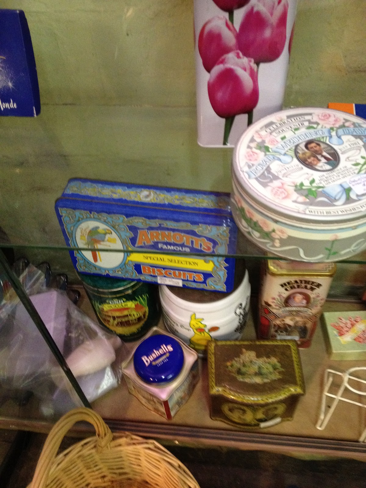
These matrix will provide the basis of my visual reference library for objects of significance within my Hons project. The objects were taken from a variety of online sources including eBay and Etsy. See below for a full cross-matrix analysis:
Comparative
Observational Matrix Analysis
This mode of research was designed to provide me with
information integral to the success of my Honours project. My Honours project
relies upon my ability to choose objects of significance that reveal the
narrative and character without direct input from the character herself. Objects
of significance, refers to objects that are significant to the character, the
story and the setting and it is through the objects that the audience is
invited to actively participate in the construction of the narrative.
This quantitative data collection and subsequent comparative
analysis will provide me with visual references in creating these objects of
significance. The original source of the objects is less important as it is in
the visual- design, shape and colour- that I am collecting information useful
in interpreting how these objects should look within the project and not the
history of the object itself.
The idea behind the collation of the comparative matrix was
to collect objects noted as being within a particular era. The broad parameters
enabled me to collect objects with a variety of shapes, design features and
colours to provide a visual cross section of designs from the 1930s-40s and
modern day objects. The only requirement was that the piece had to be
stipulated as coming from a particular era, be in keeping with expectations of
that era and not be a form of retro style that could blur the recognition of a
particular object as being from a particular era. This was particularly an
issue in relation to the collation of objects from the modern day, as many
items now use a retro look as a selling point in their design, most notable in
this was the kitchen items and radios. The objects of significance themselves
were selected based on their prominence in the story and the importance of
their visual transformation (as per the narrative) from the 1930s-40s to
current day items.
Variables such as the legitimacy of certain objects as being
a part of a particular era and the organisation and selection of the actual
objects on the matrix are acknowledged, but since it was the visual qualities
of the objects that were to inspire my own incarnation of specific objects
within the narrative it is believed that these variables are outweighed by the
variety in the objects selected and the way in which these objects were to
inspire rather than become the objects used within the project. From the cross
section of object designs from individual eras I will be creating my own
representation of these objects from a range of objects listed on the matrix
not from a single source. This will enable me to capture the design essence of
an era rather than simply copying a single object from a single source as
definitive of an era.
When viewing the matrix, images of objects were collected
then colours were recorded to provide me with a base palette when considering
the objects in their respective eras. The shape component utilised the idea of
silhouette and was a combination of design aspects that were prominent in each
of the objects selected within a particular era. This silhouette will form the
basis of my own visual interpretation of the object as seen within the project.
Individual observations, similarities and differences were then recorded in
relation to a particular group of objects for example cars, kitchenware and
radios.
In an attempt to become familiar with the visual essence of
an era across a range of objects it is also useful to compare not only within a
single matrix but also across the three matrix to identify similarities and
hence capture a sense of continuity in design identifiable in a particular era.
The objects from the 1930s-40s did display similarities in
design that I was not expecting given the historical era in which they were
created. Given that the 1930s and 40s were a time of economic and social
upheaval in Australian society with the 1929 American stock-market crash and
the associated depression followed by the Australian entry into World War Two
in 1939, I had expected the design of cars, kitchenware products and home
appliances such as radios to be exceedingly plain and functional. However
across each of the object groups in this era there was an attention to detail
and a design emphasis on long sweeping curves, curls and flourishes. Of course
these objects would not have been available to every social strata of society
but I selected objects that would have been present in the narrative of my
project (white, upper/middle class suburban). Cars would have been a rare
commodity in this time period as most people would have walked or taken public
transport so the design quality of the car in this era can be closely aligned
with the upper social classes only. Yet, these same design qualities are found
within household objects frequent within the aspirational middle classes of
society. Teacups and kettles seem to have been designed with an emphasis on the
English tradition and heritage associated with the domestic ritual of tea
drinking. Teacups with scalloped edges, gold trim and a dominance of floral
motifs all reinforce this idea of a typically English tradition that was
refined, civilised and a small statement of luxury amidst a broader social
context of change and strain. This emphasis on curves and flourishes in design
also carried over to the central appliance of any household wealthy enough afford one, the wireless. The radios of the
1930s-40s were works of art and their design reveals the prominent position
they would have played within the household. These boxes were designed to be
seen in the ‘good room’ and their delicate wood carved flourishes and art deco
style shapes indicate that the radio itself was as important as the link they
provided with the news and entertainment of the day.
Now seen by some as fussy, the flourishes and flounces
present on many objects from the 1930s-40s including cars, radios and
kitchenware have now been replaced with a harsh streamlined functional look of
the current day design across the very same objects. Cars, although now
available in many more colours, have an almost uniform flowing design that seem
to hug the road, is lower to the ground and designed to evoke a sense of speed
in contrast to the boxy tall shapes of the past. This streamlined almost no nonsense
shape follows through to kitchenware and radios where there is a focus on
neutral earthy tones and colours in kitchenware that could be seen as a focus
on reaching the widest possible demographic to compliment a myriad of
individual styles. Cups and mugs are thicker, chunkier with large handles designed
over the smaller delicate teacups of the 1930s and 40s. This perhaps reflects
the changing nature of the tea drinking ritual with people no longer having the
time to sip tea at a specific time of the day and instead make a cuppa and
drink it as they work. The radios of modern day have also shifted in their
emphasis and there seems to be more concentration on the function of the radio
rather than the look of the object itself. Although many now have lights, these
boxes made of plastic and usually black or grey are no longer designed to be
the centre piece of a room, they are expected to be unseen. The radio is no
longer a status symbol in this format, it is the advancements in the audio and
function of the unit that is now the focus, these radios are designed to be
heard and not necessarily seen.
Given that my project will use these objects to show the
contrast between a golden age that is a memory and the ‘realities’ of today, it
has been useful to compare and identify the similarities between the objects
across the three matrix. From this research I now have a reference library and I
will be able to create objects that have a design grounding in the era in which
I am representing within the narrative.
Thursday, April 26, 2012
Comparative Matrix: Quantitative Research (Part 1)
An integral part of my Hons project is the use of objects from the 30s-40s and their modern day equivalents. In the project these pieces will morph as the memories of the old woman come back to her in the quiet of everyday activities such as making tea or going to the shops.
To start this process of visual research I listed out the objects of significance and then in the tradition of quantitative researchers such as Bernd and Hilla Becher (The Water Towers), I set about to collect images of these objects and will investigate in a comparative matrix the similarities and differences between the eras and across different objects from the same era.
This in turn will help me 'create the world' of my project and furthermore assist in the morphing of the objects by providing me with the extremes that can then be used to map the change that would occur if the objects were to morph in real life.
At this stage in the research I am collecting images from various sources. As my research is focused more upon the generalities of the design of the object I am less concerned about the history of the piece and more upon the overall look of the piece that will become a part of a combined vision (colour, design, shape) of what that particular object may have looked like in the memories of the old woman in my project. Therefore images of the objects have been taken from various online sources such as online auction sites such as eBay, Etsy and online antique markets based on searches for the objects and the year in which they were popular or produced.
To collect all these images online I have been using a new online program called Pinterest. Pinterest allows me to set up virtual pinboards onto which I can pin images I have collected from online sources. I have created a pinboard entitled Vintage that holds all images of objects of significance from 30s-40s to modern day objects.
The Vintage board on Pinterest:
This virtual pinboard is not the analysis of the objects, merely a means of collecting them and organising them, however one of the benefits of the boards is the ability to see all objects laid out together and already I can see similarity in shape, colour and design across objects from the same era from cars to kettles to teacups. It is this later process of analysis in a comparative matrix that will allow me to capture an era and tell a story through a single object that will be the key to the success of my project.
To start this process of visual research I listed out the objects of significance and then in the tradition of quantitative researchers such as Bernd and Hilla Becher (The Water Towers), I set about to collect images of these objects and will investigate in a comparative matrix the similarities and differences between the eras and across different objects from the same era.
![]() |
http://worldwaterneeds.tumblr.com/post/343051188/becher-water-towers |
This in turn will help me 'create the world' of my project and furthermore assist in the morphing of the objects by providing me with the extremes that can then be used to map the change that would occur if the objects were to morph in real life.
At this stage in the research I am collecting images from various sources. As my research is focused more upon the generalities of the design of the object I am less concerned about the history of the piece and more upon the overall look of the piece that will become a part of a combined vision (colour, design, shape) of what that particular object may have looked like in the memories of the old woman in my project. Therefore images of the objects have been taken from various online sources such as online auction sites such as eBay, Etsy and online antique markets based on searches for the objects and the year in which they were popular or produced.
To collect all these images online I have been using a new online program called Pinterest. Pinterest allows me to set up virtual pinboards onto which I can pin images I have collected from online sources. I have created a pinboard entitled Vintage that holds all images of objects of significance from 30s-40s to modern day objects.
![]() |
My boards on Pinterest |
The Vintage board on Pinterest:
![]() |
This virtual pinboard is not the analysis of the objects, merely a means of collecting them and organising them, however one of the benefits of the boards is the ability to see all objects laid out together and already I can see similarity in shape, colour and design across objects from the same era from cars to kettles to teacups. It is this later process of analysis in a comparative matrix that will allow me to capture an era and tell a story through a single object that will be the key to the success of my project.
Tuesday, March 27, 2012
Preliminary Visual Research
Part of the challenge with the project meets exegesis thing is that you have to get your head around the fact that you aren't doing two separate components of a written and a film. Rather you are using the written research to inform the decisions that you make about your project and help to extend the knowledge base through your findings. Once I got my head around that I found it much easier to come close to a question to focus my research that contextualises my animated film.
Another challenge for me has been to see the act of drawing as research. Visual research is going to be a large part of my film given that I am not only focusing on environments and objects in animation, but I am also setting the narrative in a real place (Ashfield/ Croydon in Sydney) and in a real time (1930s-2000). So, in the spirit of visual research I have included some of my preliminary sketches of objects and places. What I will be doing at a later date is compiling a visual comparison of different objects and places cross referenced with an era in history. This process will allow me to see patterns in visual design including common shapes and colours that are present in objects and places from cars to cups (in some form) in a particular decade.
Subscribe to:
Posts (Atom)